Mobile Booking Experience for Childcare Using a User-Centered Approach
Effortless Childcare Booking System for Busy Parents
"Experience seamless booking and peace of mind with our app designed for busy parents."
Introducing K Nest, the new iOS app designed to simplify daycare booking for busy parents. With K Nest, you can effortlessly find and book the best daycare options for your child, ensuring a seamless experience. Say goodbye to the stress and hassle of searching for reliable childcare. K Nest provides peace of mind by offering a comprehensive and user-friendly platform that connects you with trusted daycare providers. Simplify your life and focus on what truly matters with K Nest, where booking daycare is made easy and convenient for parents.THE CHALLENGE:
Many parents face challenges finding available, suitable child care spaces.
Over one-quarter of children not in child care are currently on a wait-list, according to Statistics Canada.
In 2023, 26% of parents with young children reported wait-list issues, up from 19% in 2022.
WHAT I DID:
Conducted user interviews to gather insights into user needs, preferences, and pain points
Created detailed personas to represent key user groups, aligning design decisions with specific goals and challenges
Developed user flows to map out each step of the user journey
Designed low- to high-fidelity wireframes to visually structure the experience
Built interactive prototypes, testing and refining interactions to ensure a seamless user experience
Designed and launched a marketing website to communicate product value, features, and benefits, driving user engagement and brand visibility
AT A GLANCE
KEY DETAILS
PROJECT OVERVIEW
11 Weeks
TIMELINE:
ROLE:
UX Researcher, UX Designer, UI Designer, UX Writer
Google Doc, Otter.Ai, Figma
TOOLS:

PROJECT BACKGROUND
Parents relying on child care services face challenges in finding available and suitable spaces for their children. According to Statistics Canada, over one-quarter of children not currently in child care are on a wait-list. In 2023, 26% of parents with children aged five and under reported this issue, an increase from 19% in 2022.Identifying the Problem
Project Goal
To create a digital solution to help parents who have young children secure accessible and suitable child care service.METHOD
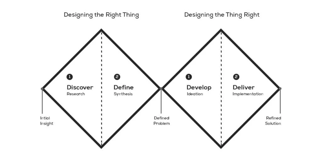
Using the convergent and divergent thinking of the Double Diamond Design Methodology, I developed and explored a broad spectrum of ideas before honing in on a specific course of action. This well-established creative process guided me through four distinct stages, effectively organizing my design workflow.DISCOVER
ResearchKey InsightsDEFINE
PersonaUser StoriesTask SelectionDEVELOP
SketchingWireframes & PrototypeUser TestingDELIVER
Visual IdentityMarketingNext StepsDISCOVER
Problem Space
SECONDARY RESEARCH
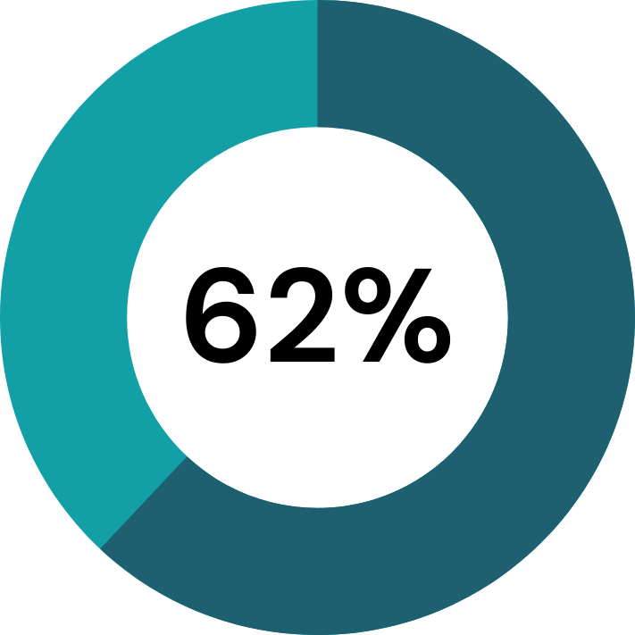
In 2023, about one-quarter (24%) of children aged 1 to 3 years and 9% of children aged 4 to 5 years were on a waitlist.Difficulty finding available care remained the top challenge for parents, and the proportion of those reporting this difficulty increased 62% in 2023.-
I researched the challenges parents face in securing childcare in Canada, finding that waitlists for childcare centers range from one to three years due to factors like application date, child’s birth date, and available space.
-
Parents in Calgary find it hard to secure a child care services
Parents in Calgary want good quality and care for their children when they are put in a child care service.
Parents in Calgary want affordable child care providers
-
I believe that parents in Calgary are not able to secure a spot for their child in child care services.
I will be able to confirm this through my interviews when 2 out 3 confirm my statement.
DESIGN CHALLENGE
How Might We Question?
How might we help parents in Calgary Alberta who have young children secure accessible and suitable child care service?
DEFINE
PRIMARY RESEARCH
I conducted 3 individual interviews with target users via Google Meet to gather qualitative and attitudinal insights regarding their experiences in finding daycare. The interviews were guided by a structured format with prepared questions through my interview guide.Understanding The User
Participant Criteria
CALGARY
RESIDENT
1 - 5
YEAR OLD CHILDREN
30 - 35
YEAR OLD
SEARCH
FOR CHILDCARE
KEY INSIGHTS & INTERVIEWS
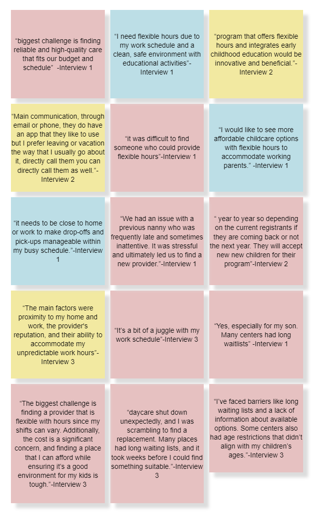
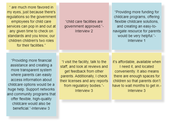
From the interviews I put each interviewees statements on a sticky note to group them into pain points, motivation/goals, and behaviors. Then I analyze each sticky note to group themes to create an affinity map to find the themes and insight. decided to focus on the theme Quality and Nurturing Child Care EnvironmentAffinity Map
PAIN POINTS
MOTIVATIONS / GOALS
BEHAVIOURS
Themes and Insights
CONVENIENCE
Parents look for accessible and flexible child care solutions that can accommodate their work schedules. QUALITY AND NUTURING CHILD CARE ENVIRONMENT
Parents prioritize high quality child care that offers a nurturing and safe environment with experienced and attentive staff, educational programs, and affordable options, reflecting their desire for a balanced, reliable solution that supports their children's growth and well-being.CHOSEN THEME AND INSIGHT
GOVERNMENT APPROVED FACILITES
Parents value regulated environments that ensure safety and quality, as well as increased funding and resources to make childcare more affordable and accessible.Introducing Amy Mouson, a persona designed to represent a diverse range of users. Amy is a 34-year-old single mother with one child, who faces challenges in finding daycare services that offer flexible hours. Her primary concern is ensuring her child has a safe and nurturing environment to learn and grow while she is at work.Persona
OPPORTUNITIES FOR DESIGN
Experience Map
Using Amy's experience map, I created user stories in the format 'As a (user), I want to (action) so that I can (benefit).' This process helped me brainstorm and determine the core functionality and features of my solution.User Stories & Epic
As a Parent, I want …
The child care center to promote an inclusive environment that respects and celebrates diversity, so my child can learn about and appreciate different cultures and backgrounds.The child care center to provide support for children with special needs, so every child can receive appropriate care and attention.The child care to be staffed by experienced and certified professionals so that I can be assured that my kids are being treated well.Them to provide nutritious meals so that I know my child is eating healthy throughout the day.The option of part-time or full-time care so that I can choose a schedule that fits my needs.The child care center to offer a variety of indoor and outdoor activities so that my child can stay active and engaged.The child care center to have a safe and well-equipped playground so that my child can enjoy physical activities in a secure environment.The child care center to include creative arts and crafts activities so that my child can explore their creativity and imagination.The caregivers to encourage positive social interactions so that my child can develop good social skills and friendships.Clear and detailed information about the cost of child care services so that I can budget and plan accordingly.Ease of access for communicating with the child care center so that I can stay connected and informed.Flexible payment options, such as monthly or bi-weekly payments so that I can manage my finances more easily.To know if there are priority considerations for siblings of current registrants so that I can plan accordingly for my younger children.After researching user stories and epics, the next step is to translate the chosen epic Location and Convenience into a task flow, outlining specific actions the user will perform in the product.Task Flow
DEVELOP
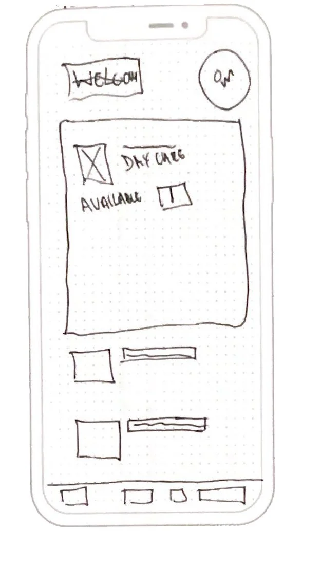
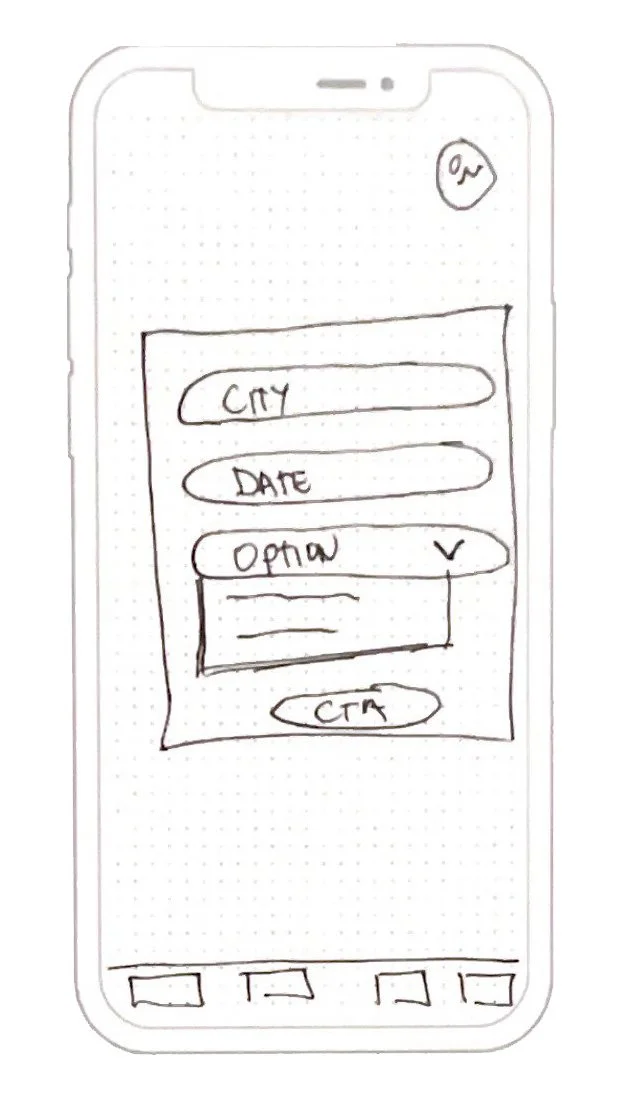
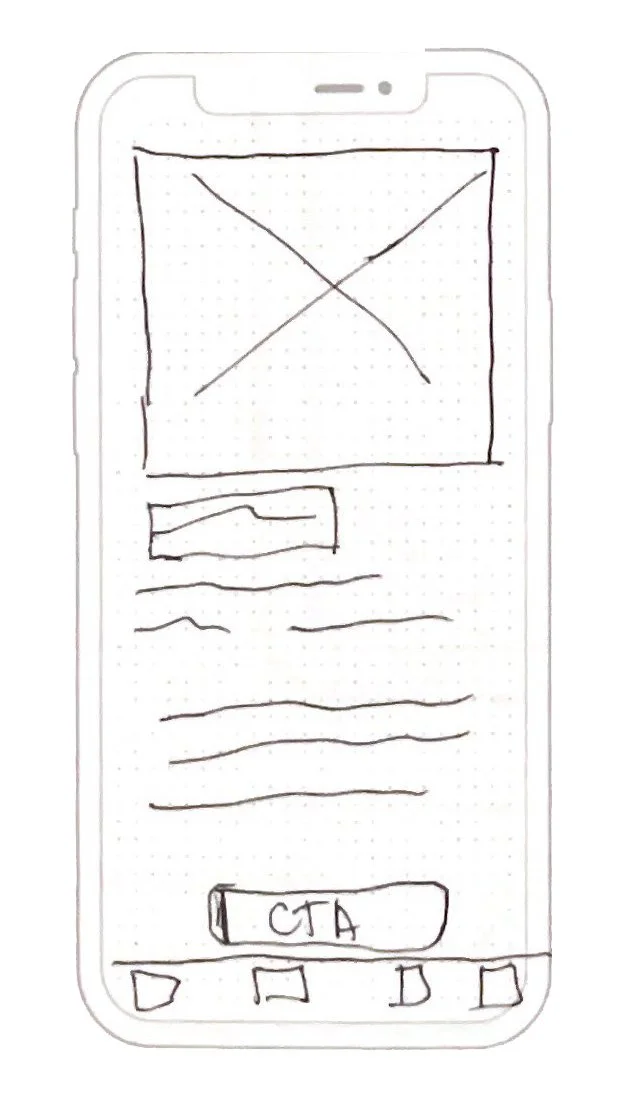
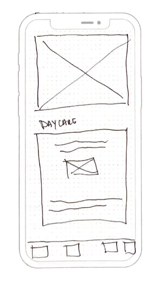
Creating an inspiration board enabled me to generate ideas for screens and make design decisions regarding the layout, features, and buttons. I then used pen and paper to create three exploratory sketches for each location in the task flow. Following this, I produced a final solution sketch.Solution Sketches
HOME PAGE
SEARCH PAGE
RESULTS LIST
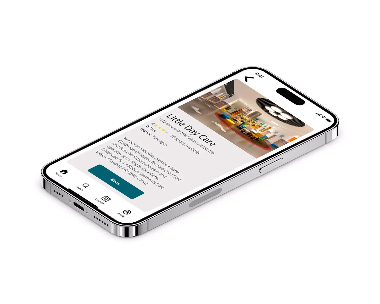
DETAILED PAGE
BOOKED PAGE
GREY SCALE WIREFRAME (SCROLL THROUGH BELOW)
Version 1
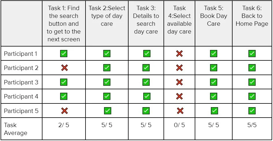
As part of the design process, I conducted a usability test with 5 participants using one persona in 2 rounds of testing. This allowed me to gather real-time feedback that can be incorporated to enhance the design and provide a more optimal user experience.Usability Testing
TASK 1
Find the search button and to get to the next screenSelect type of Day CareTASK 2
TASK 3
Details to search Day CareTASK 4
Select available Day CareTASK 5
Book Day CareTASK 6
Back to Home PageThe test results were mostly successful, but a few issues did arise. Some testers had difficulty locating the search icon and mistakenly clicked on the calendar. To address this, we should provide more distinct buttons or clearer instructions on the screen.Additionally, all participants failed to complete the task of selecting a daycare center, finding it confusing and being unsure which one to choose. To improve this screen, I suggest including the closest distance in kilometers and indicating which centers have immediate availability.Revised
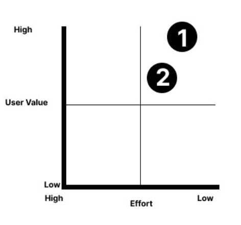
1. Found it confusing and unsure which one to select. For this screen improvement I can include the closest distance in kms and show who has an immediate availability.2. Participants tried to select the calendar icon at the start. A key insight would be to have a prominent button in the first box to get started.Design Matrix
HOME SCREEN
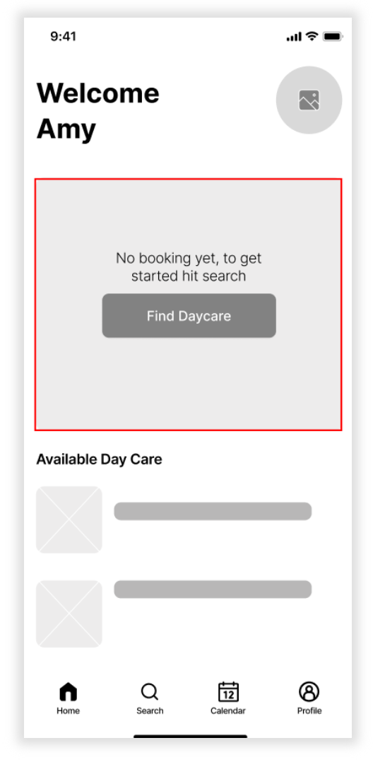
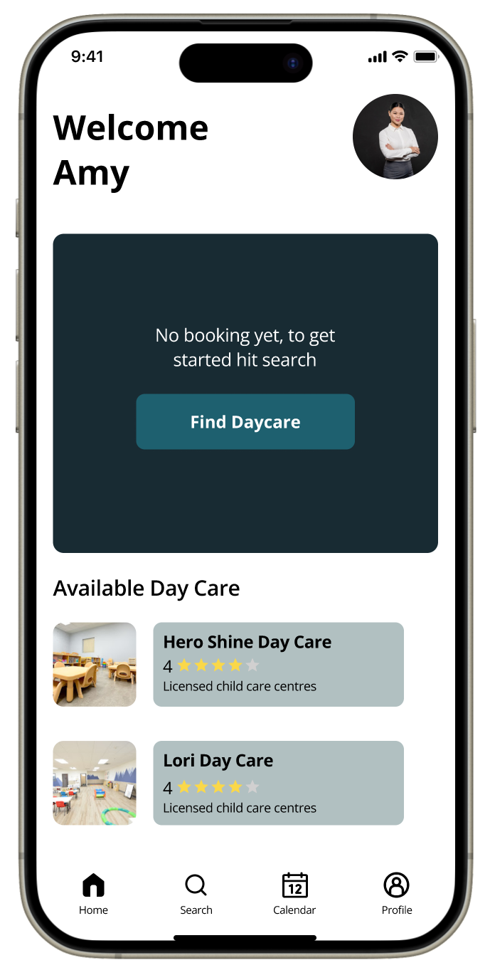
2 out of 5 participants failed to complete task 1. Both participants tried to select the calendar icon at the start. For improvement I have included a “Find Daycare” button in the first cardRESULTS LIST
All participants found it confusing and were unsure which option to select. To improve this screen, I included the closest distance in kilometers, enhanced the star rating to a five-star system, and moved the availability information above the button.DETAIL PAGE
I included the distance on this card to indicate how far the daycare is. This addition is meant to make it easier for parents to know the distance.DELIVER
VISUAL IDENTITY
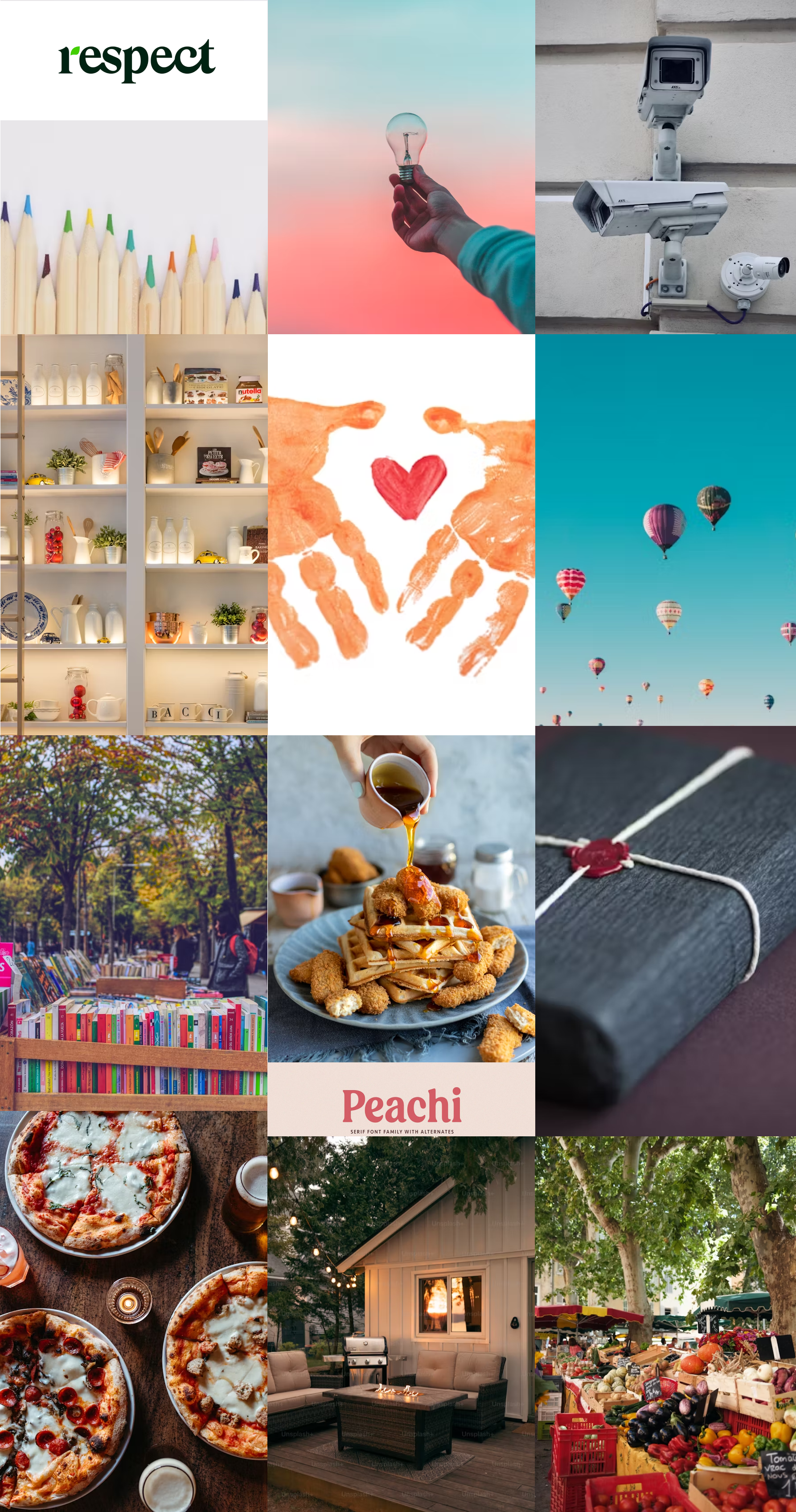
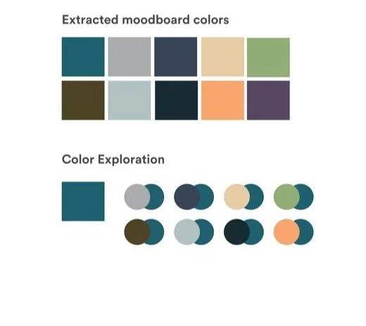
To capture the essence of my brand, I began an inspiring journey by crafting a moodboard. I started by brainstorming a list of adjectives that truly embodied the spirit and values I envisioned. With these adjectives in hand, I refined my vision by creating a More A than B list, carefully weighing qualities to ensure the brand’s personality shone through. On the next step naming the brand. I compiled a list of potential names, each echoing the brand’s core values. After much thought, I chose the name "K Nest." The "K" symbolizes kids, our primary focus, while "Nest" evokes a nurturing, safe environment where children can learn and grow.Branding
Trustworthy, Nurturing, Safe, Caring, Educational, Accessible, Supportive, Quality, Playful, Engaging
More A
TrustworthyNurturingSafeCaringEducationalAccessibleSupportiveQualityPlayfulEngaging
Less B
UnreliableNeglectfulDangerousIndifferentUninformativeExclusiveDistancedMessySeriousBoring
Moodboard
Word Mark
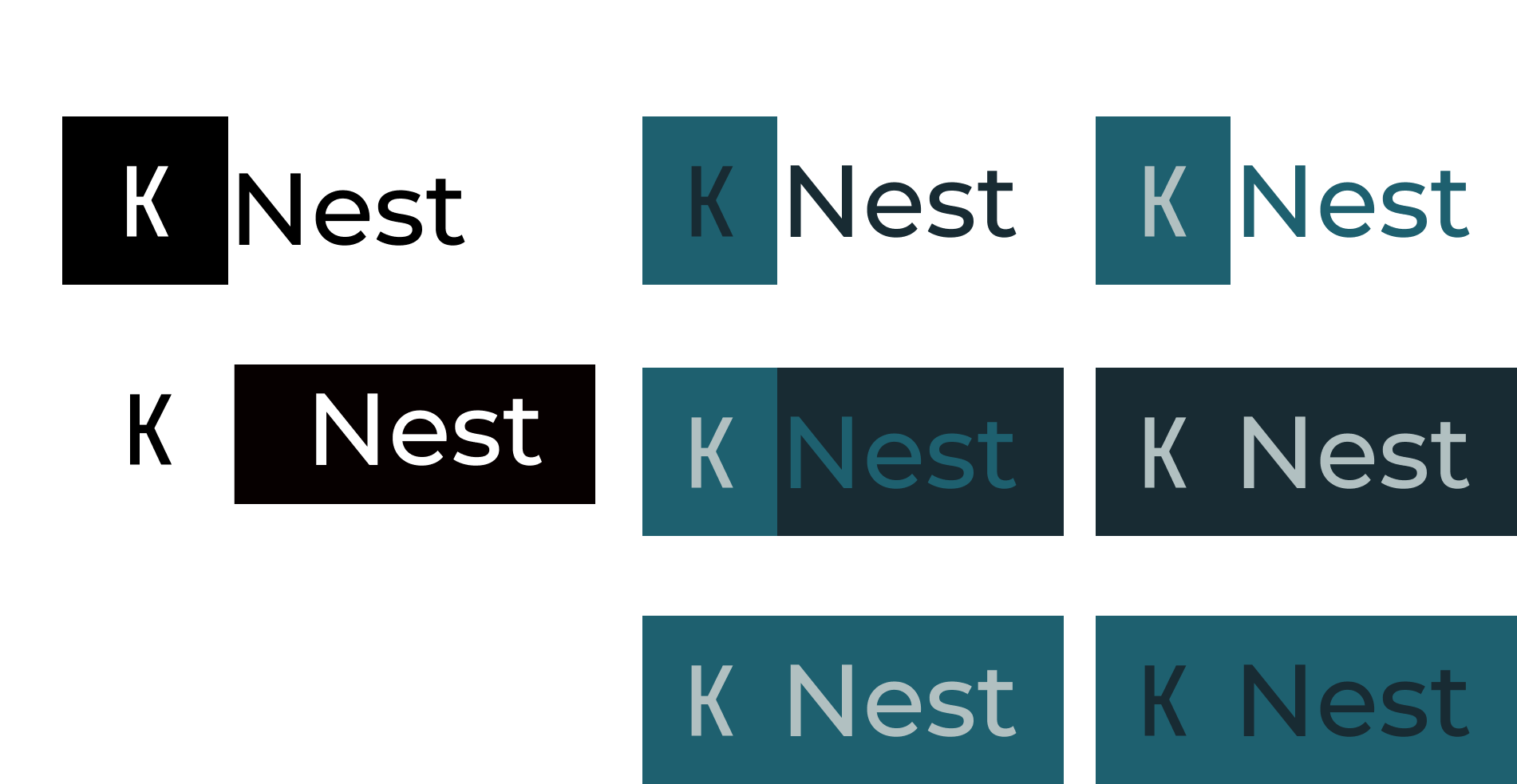
Creating wordmark that was simple and clean to make it easy to read, with a color that is gentle on the eyes.UI Library
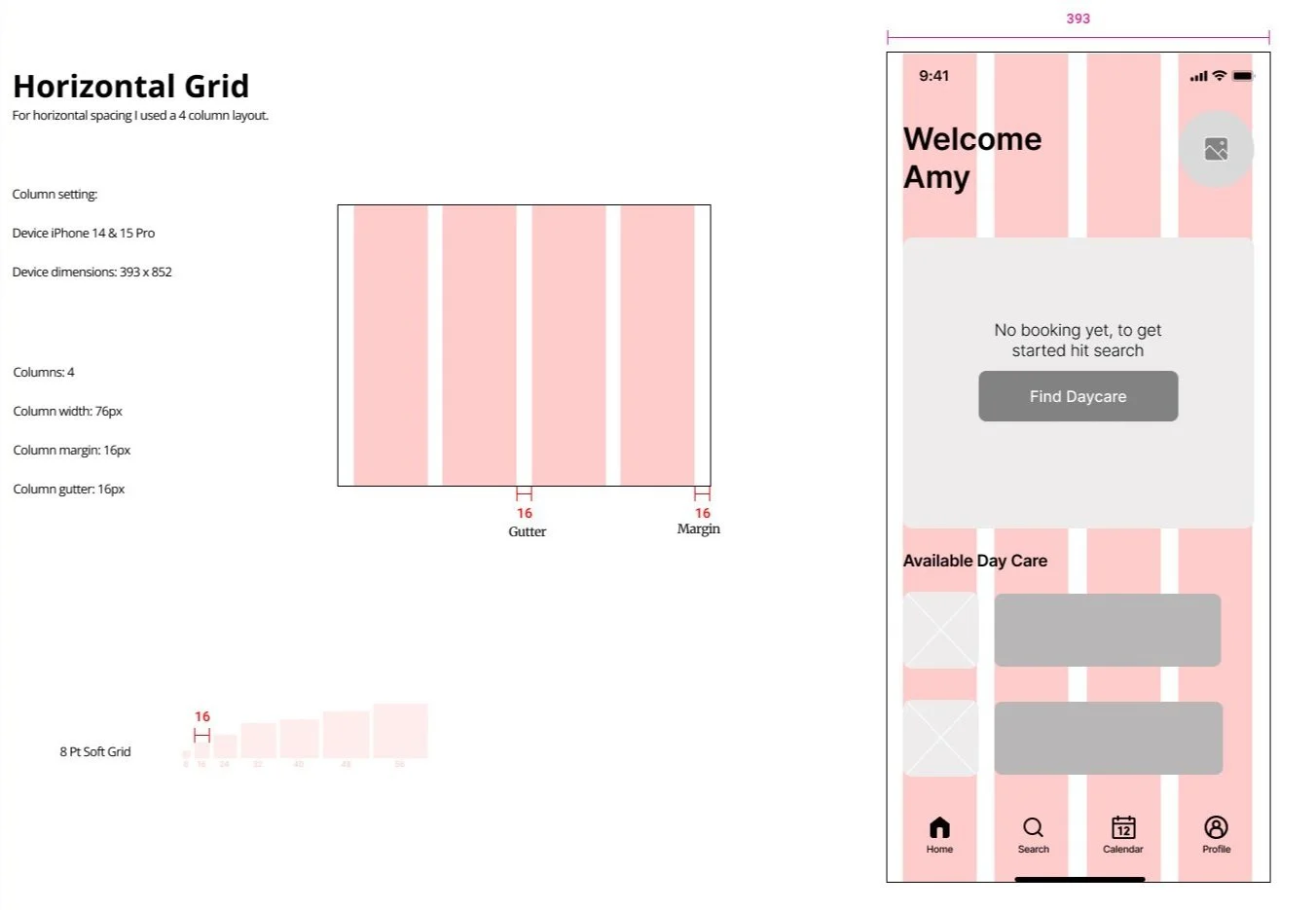
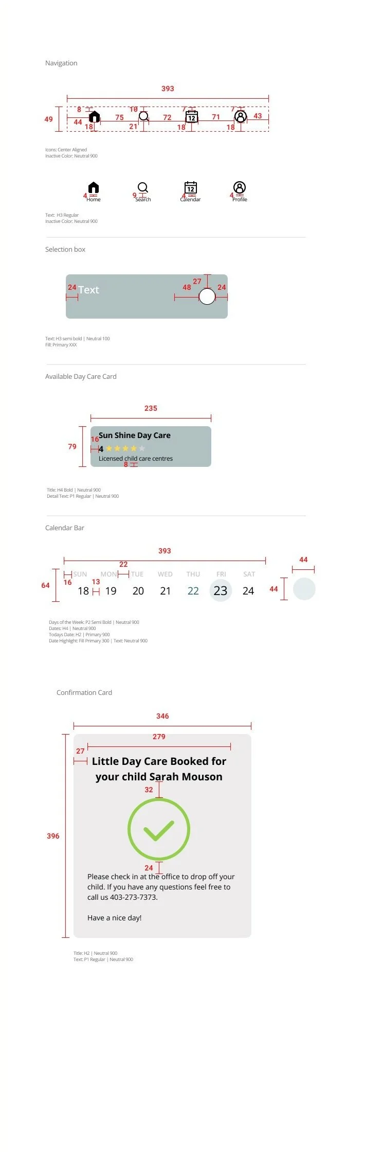
I built a UI Library for my design system by breaking down every aspect of the interface and organizing them into categoriesFinal Version Prototype
Building a Marketing Website
I created a responsive marketing website for KNest, both for desktop and mobile. Starting with UI inspiration, I created sketches, designed low-fidelity mock-ups, conducted user testing, and went through several iterations before finalizing the high-fidelity prototype.Alternate Platform Device
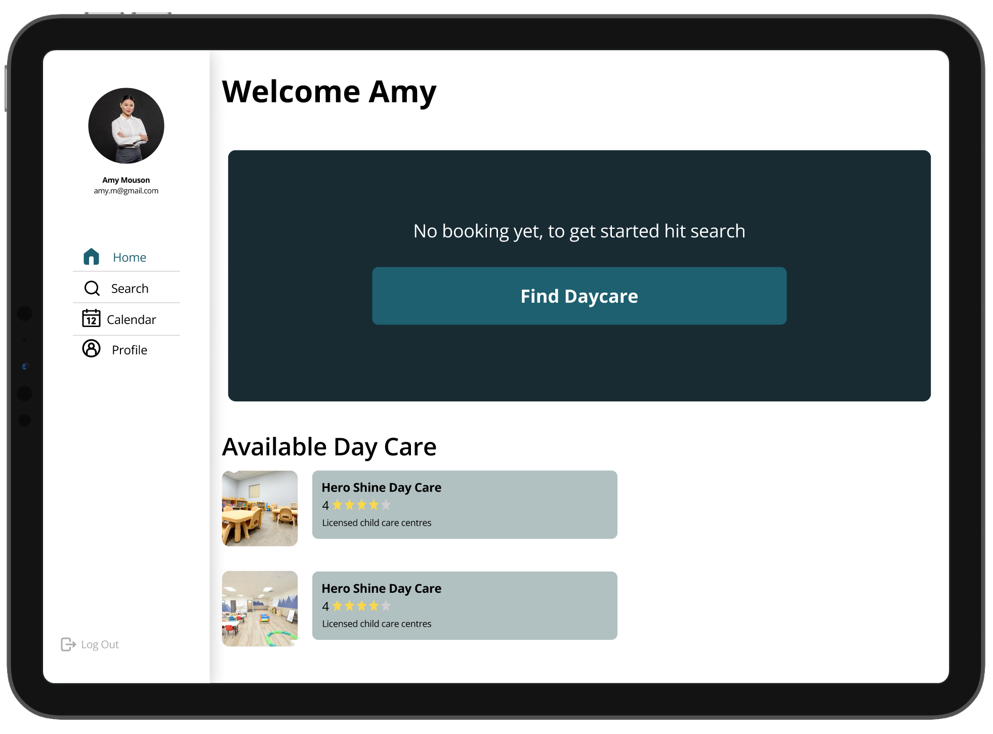
To further explore the concept, I imagined Knest's interface on a tablet. Given the need for a larger screen to efficiently find daycares, view calendar, and manage bookings, a tablet or desktop would be the most logical platform expansion. Since the groundwork for an iOS mobile app is already established, developing an iPad version would be more efficient than creating a desktop or mobile web app.ResearchI learned that researching and synthesizing interviews to identify pain points, motivations, and goals gives an overview of user needs and potential areas
FeedbackListening to feedback and incorporating it into project iterations is essential for continuous improvement
Key Learnings
To improve the app further, I would continue to develop and integrate additional features based on user needs and market trends. Following this, extensive user testing would be conducted to gather detailed feedback on these new features. This iterative process would help refine the app's functionality and user experience. After collecting and analyzing the feedback, I would implement necessary adjustments to ensure the app meets user expectations and provides a seamless experience. Finally, I would conduct another round of user testing to validate these changes.Next Steps
Design Impact
Answer to the “BFFs” cardKnest could enhance relationships by allowing parents to share daycare recommendations and experiences easily. However, if the app were to inadvertently share sensitive information or biased reviews, it might cause friction. Ensuring user control over shared content and maintaining neutrality in reviews can help maintain positive interactions.